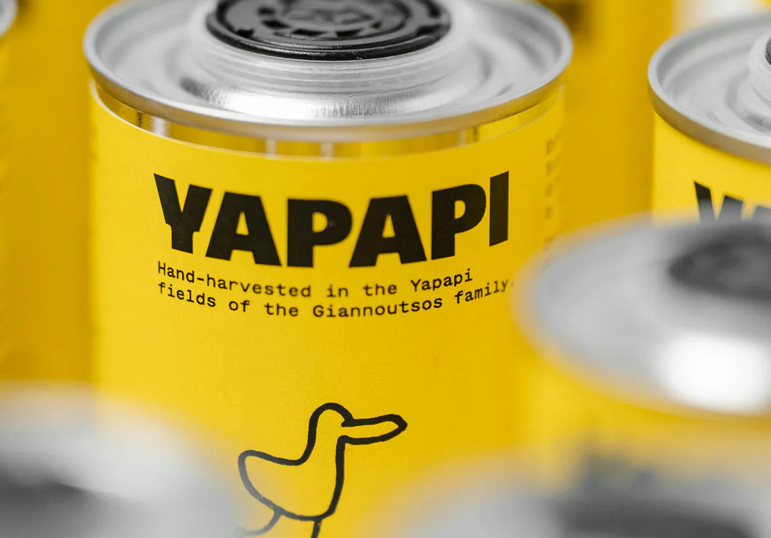
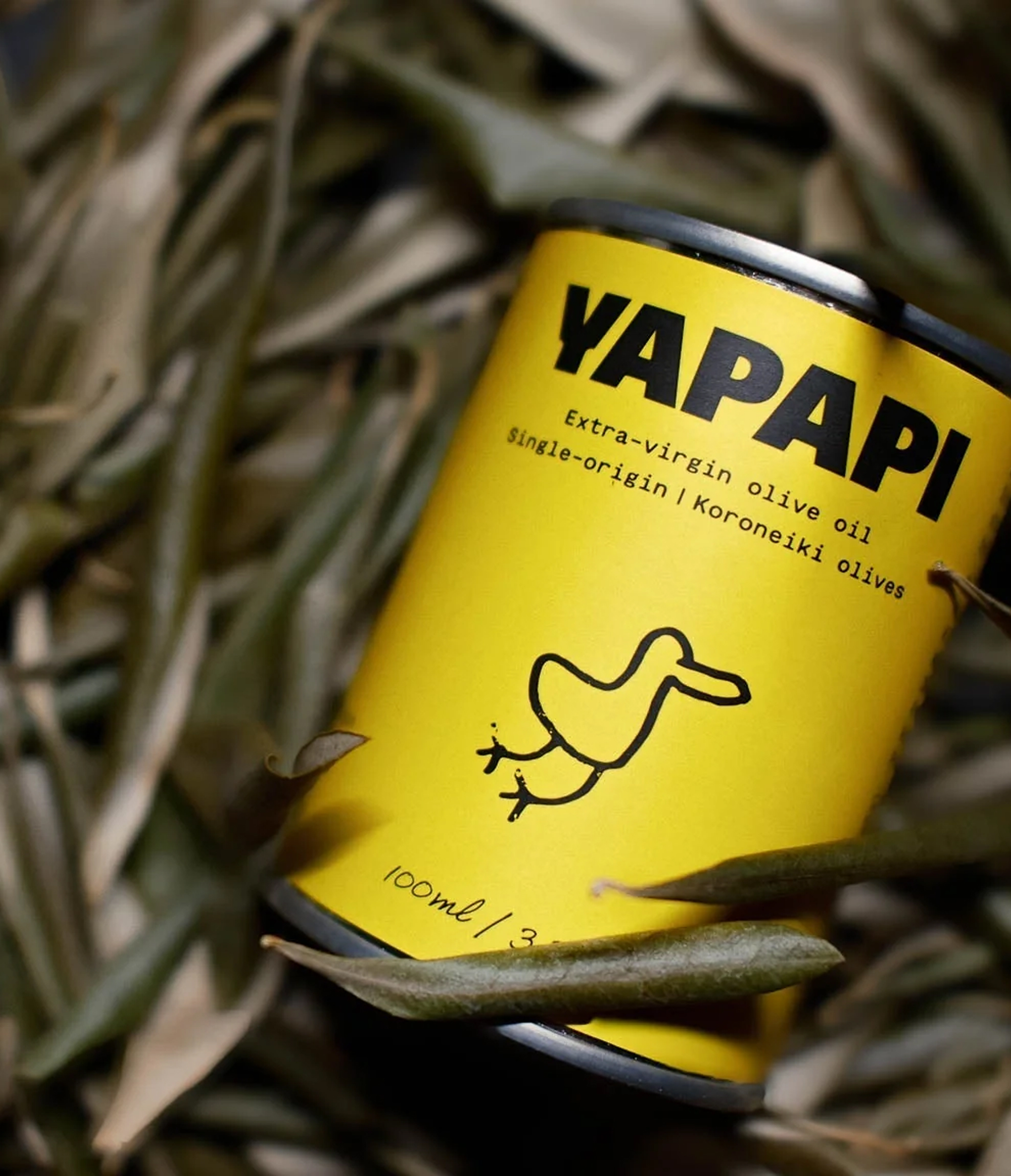
Yapapi
Familial greek olive oil
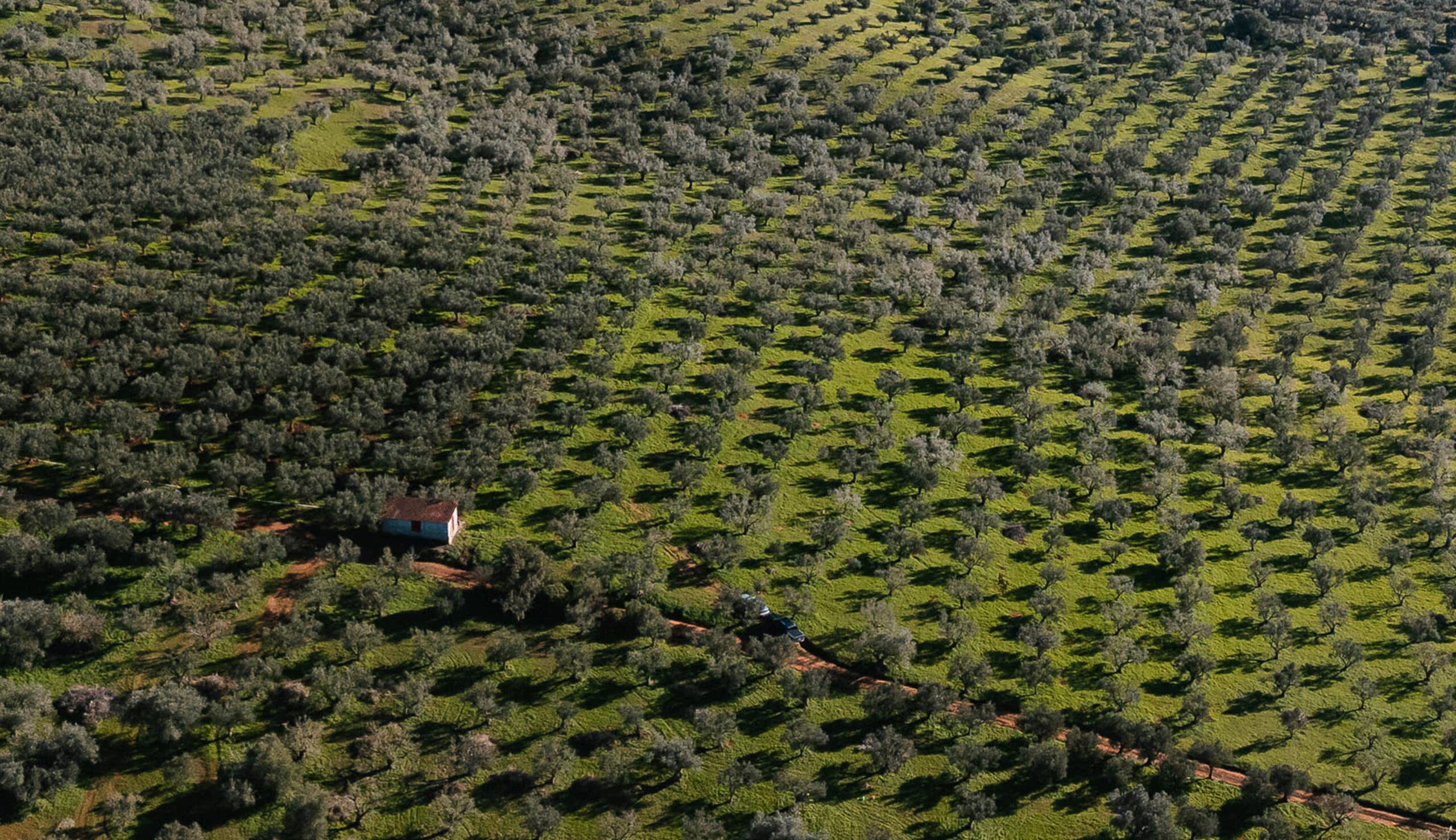
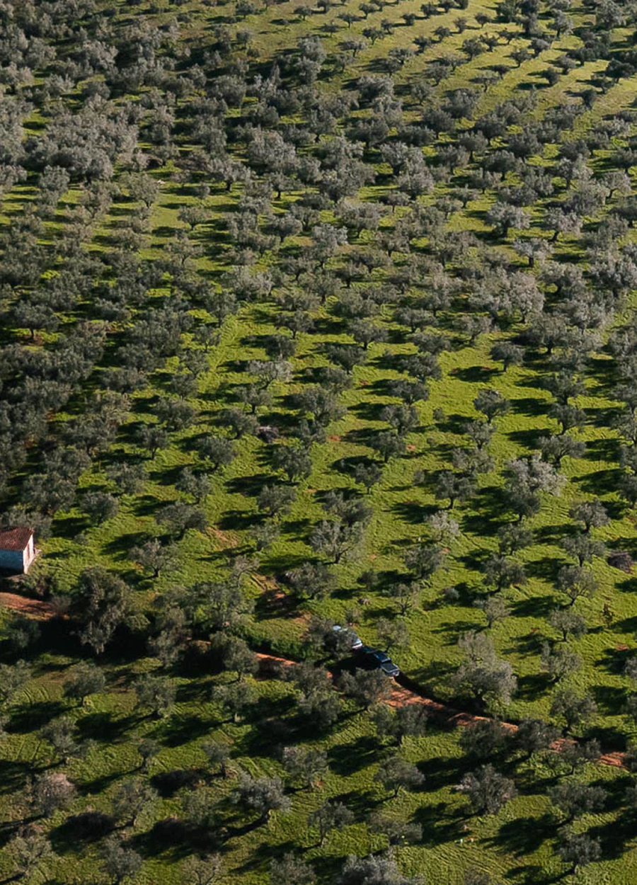
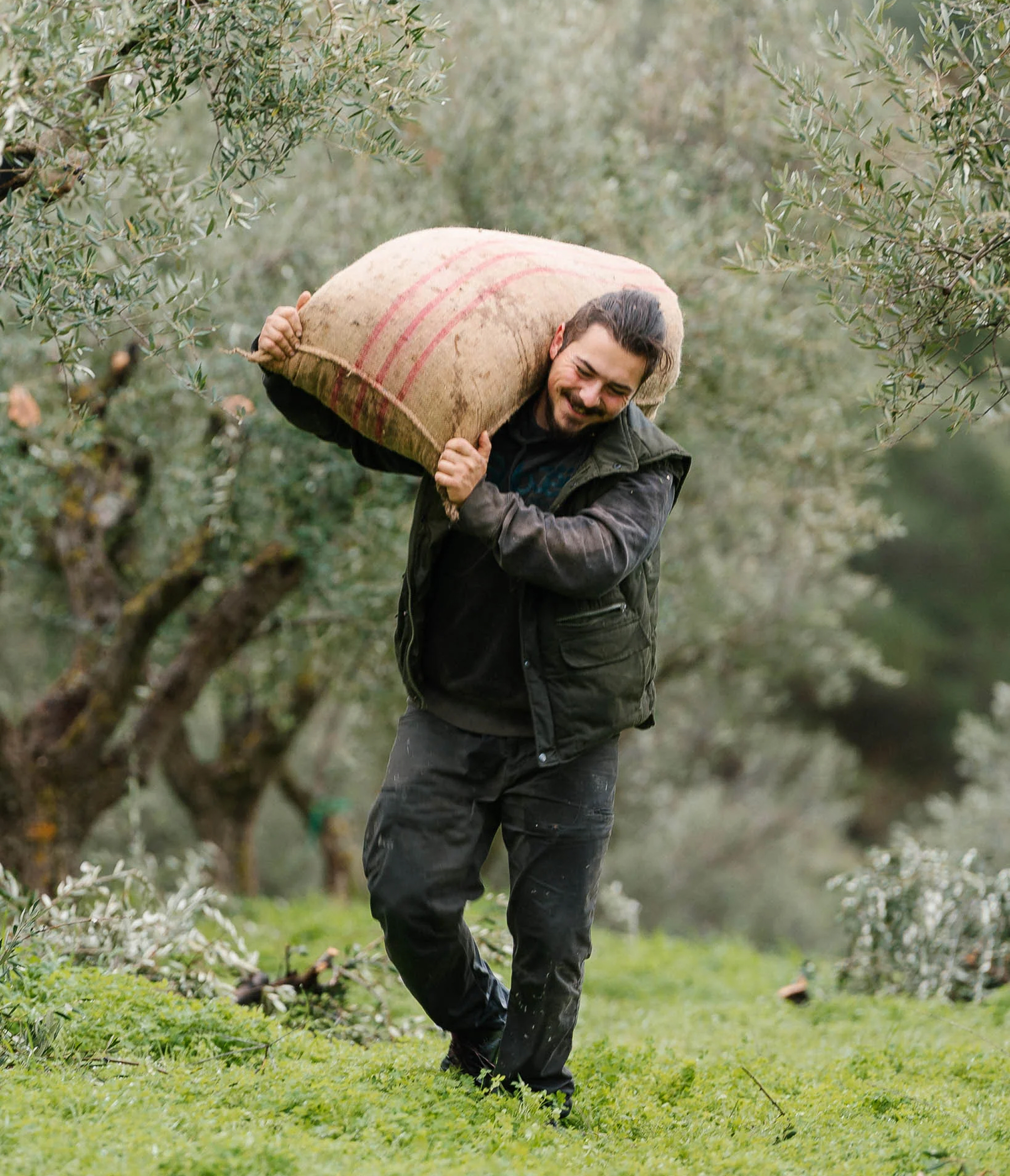
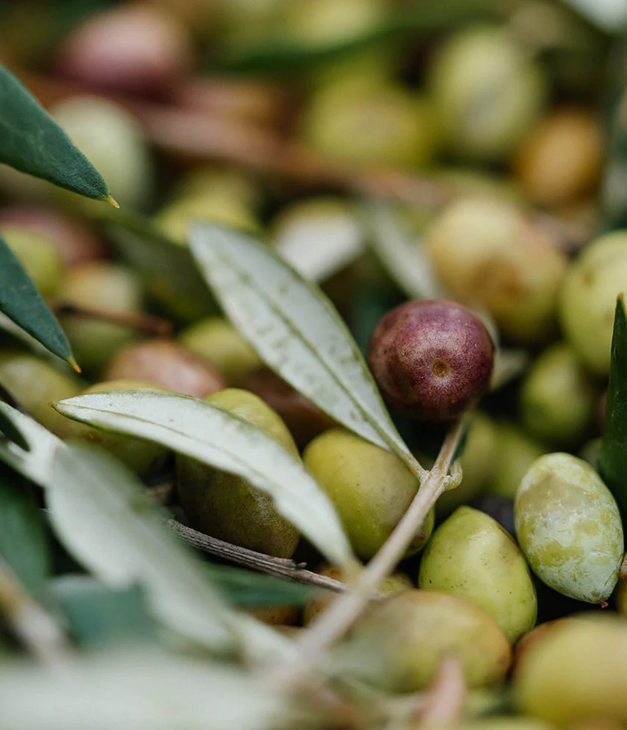
Olive oil — Kalamata (Greece)
Unique feature: olive oil produced by a family farm, sold directly by the producer
Mission: visual identity + packaging
Challenge: preserving the family and artisanal character of the brand in a highly competitive sector
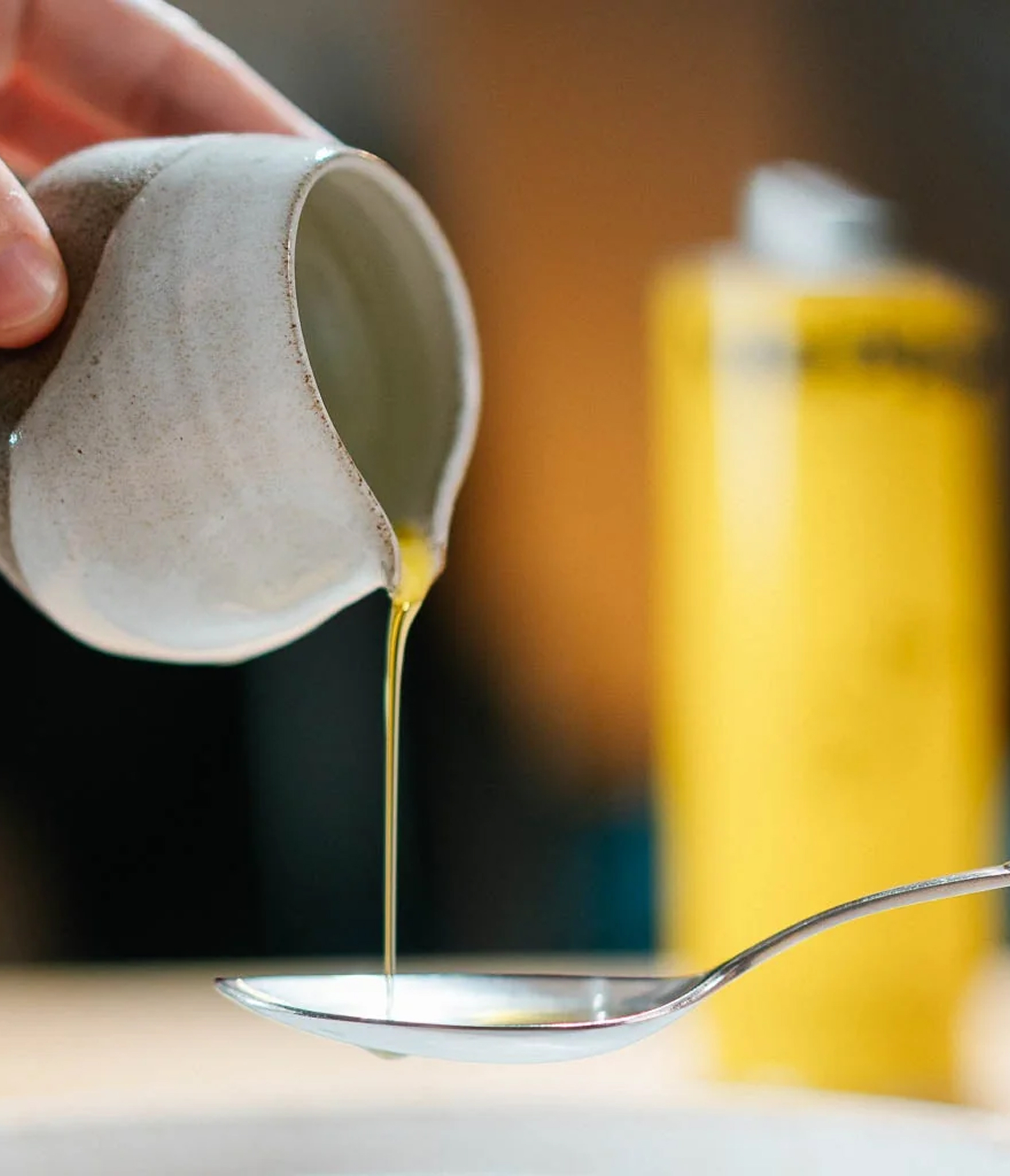
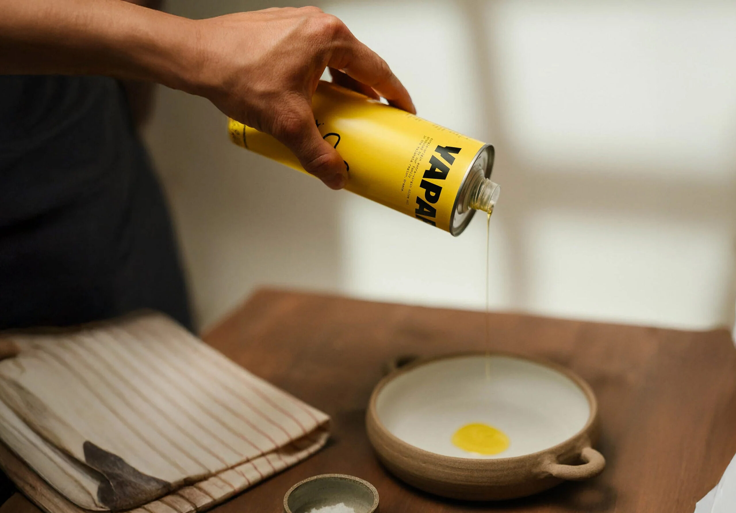
Proposal: a visual identity based on a warm, appetising yellow colour. The proposal plays on the name ‘Yapapi’, which means duck, turning it into a sign of uniqueness.
Industry
Knowledge
Artistic Direction
Packaging
Visual Identity
Packaging
Visual Identity
Collab'
Creative Director: Cécile Halley des Fontaines
Artistic Director & Production: Lucas Dubois
Project Management: Éléonore Sala
Artistic Director & Production: Lucas Dubois
Project Management: Éléonore Sala
Typography
ABC Gravity
GT Maru Mono
GT Maru Mono