Yapapi
Familial greek olive oil
Context
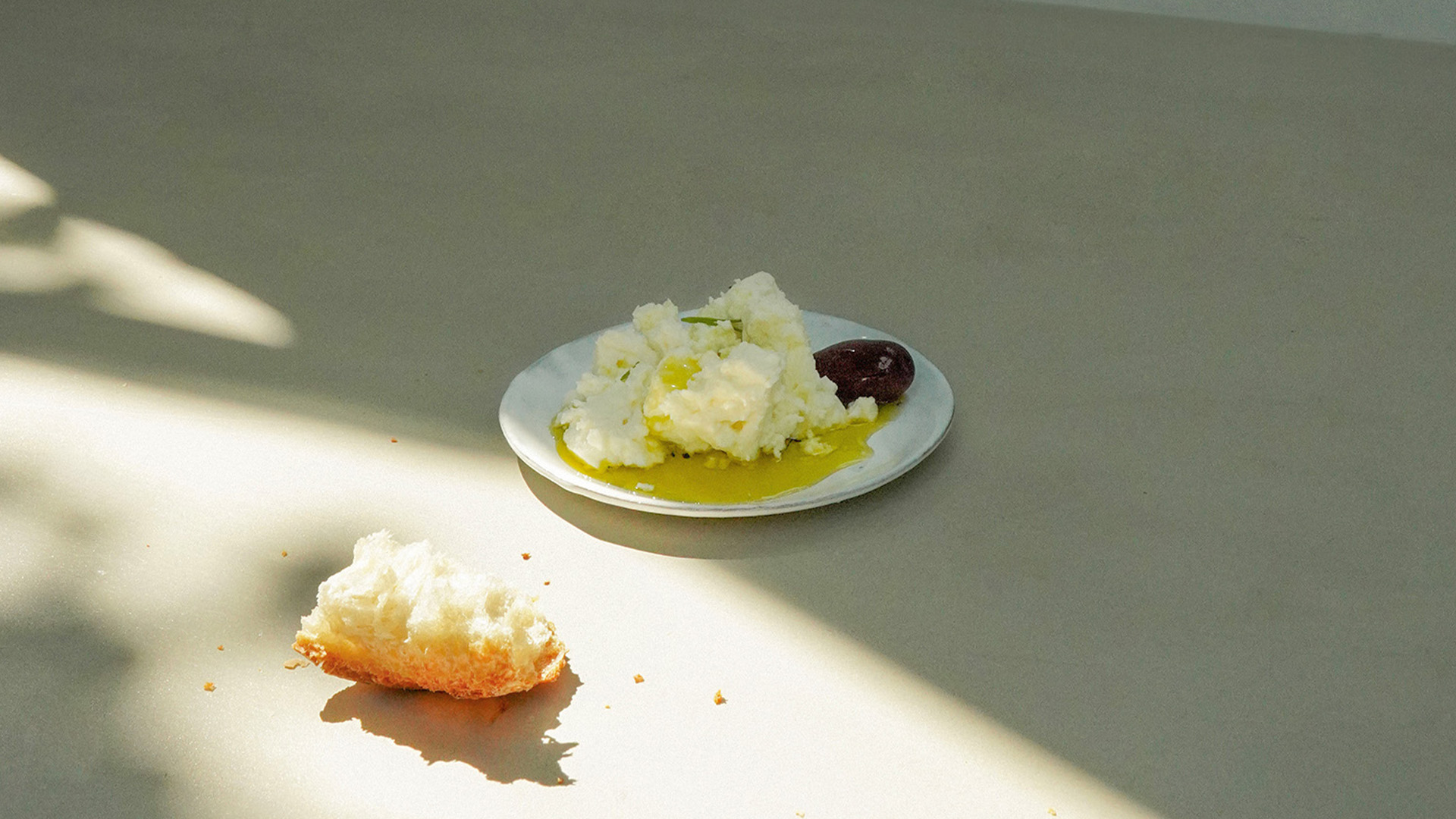
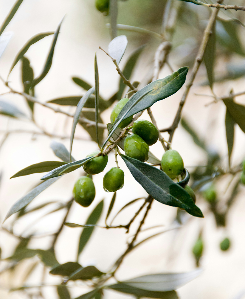
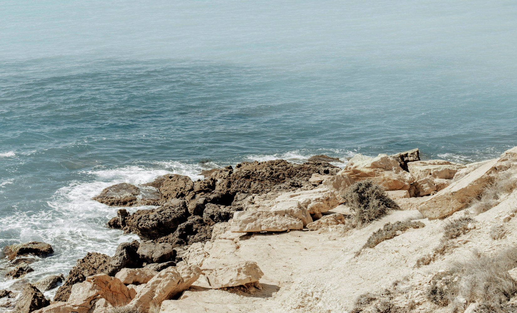
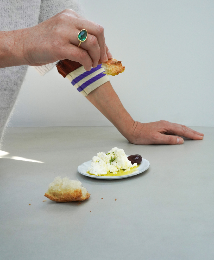
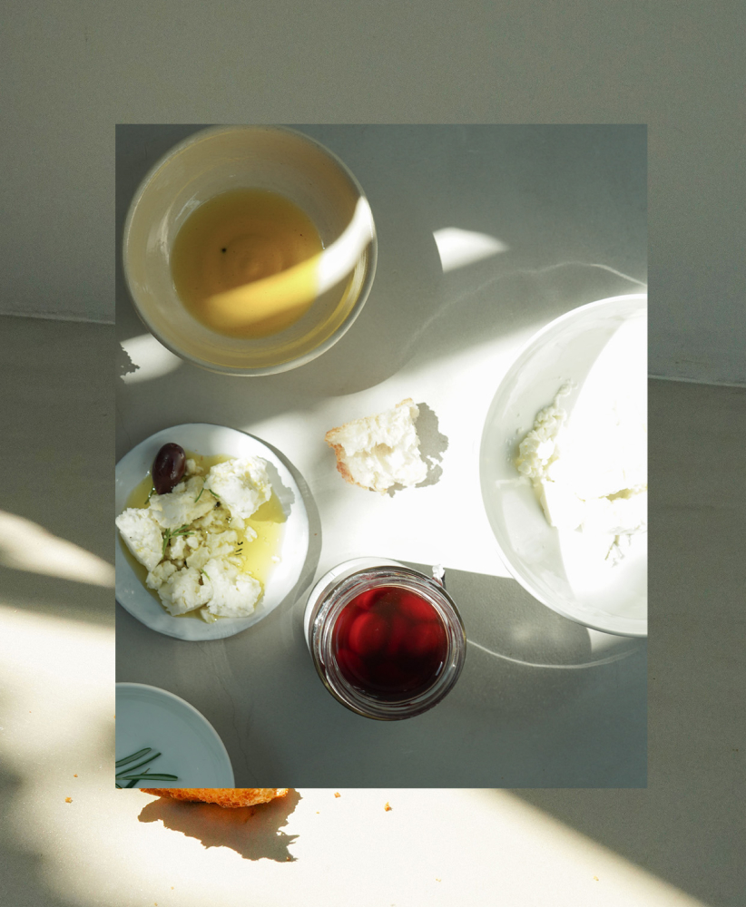
YAPAPI is the project of a Greek farming family based in the southern Peloponnese, in the Kalamata region near Pylos. They apply ancestral pruning techniques that ensure a fine harvest every year. Panagiotis and Angalos, brothers of the last generation of the family, wish to create a family olive oil brand to enhance the value of their family’s work. Their aim is to give the world access to this incredible quality olive oil, direct from the producer. The studio was in charge of creating an original and identical branding for this incredible family business.
Proposition
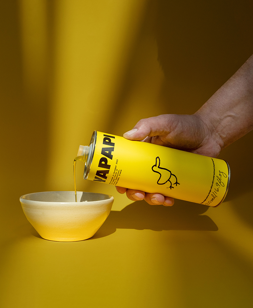
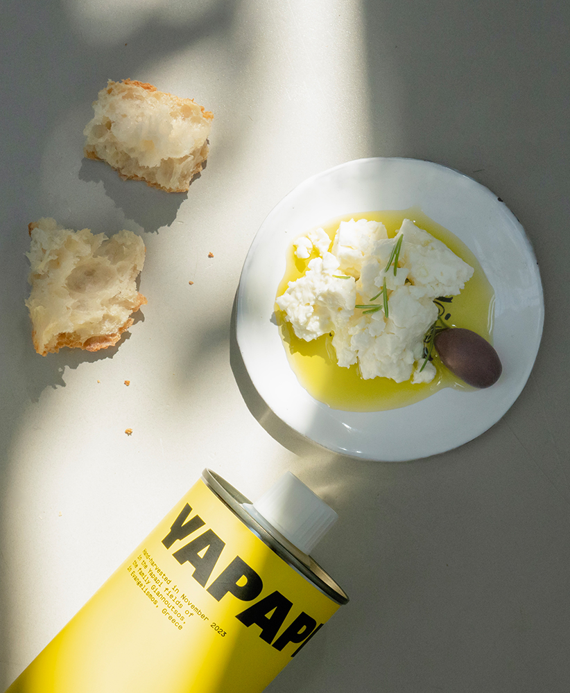
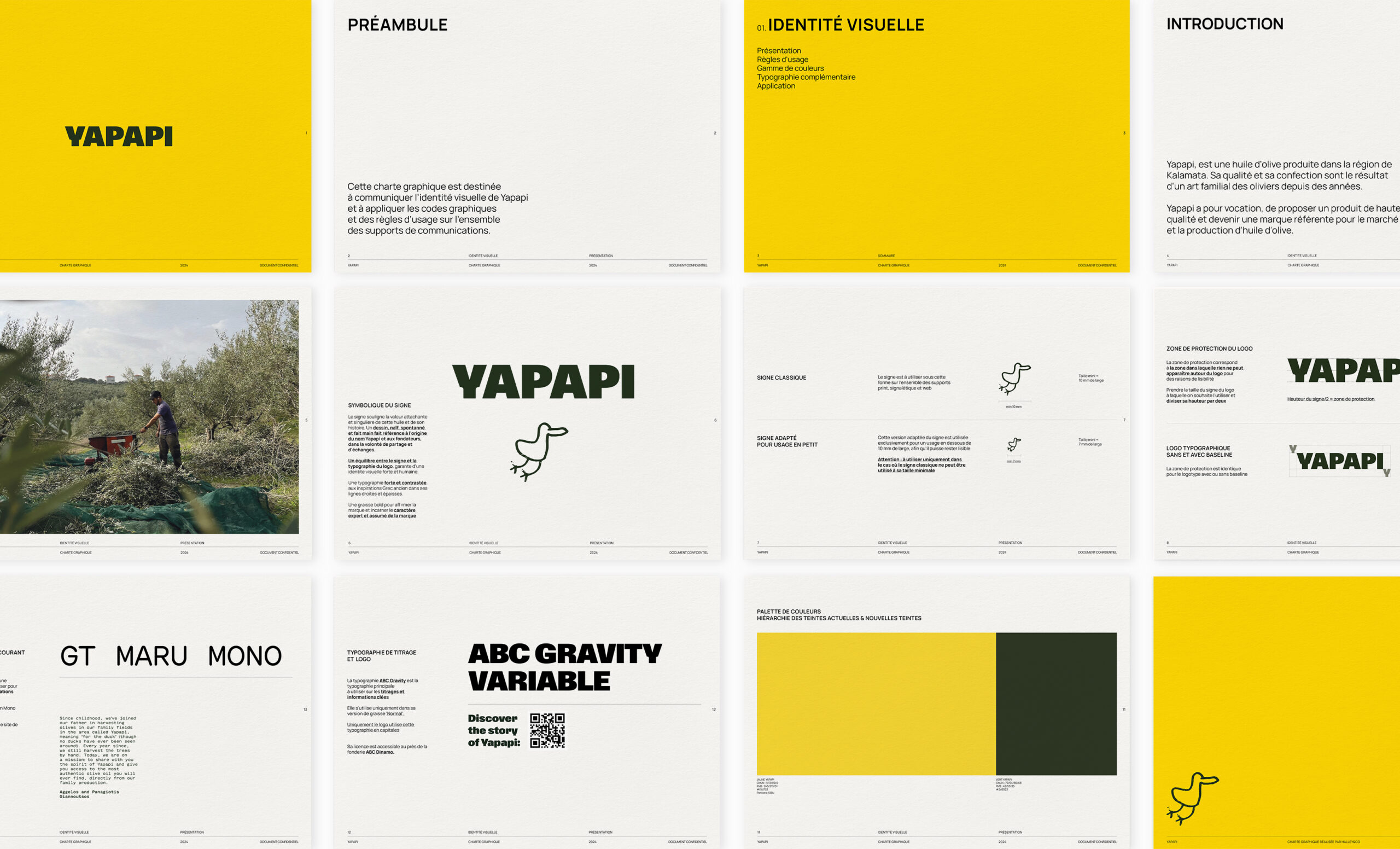
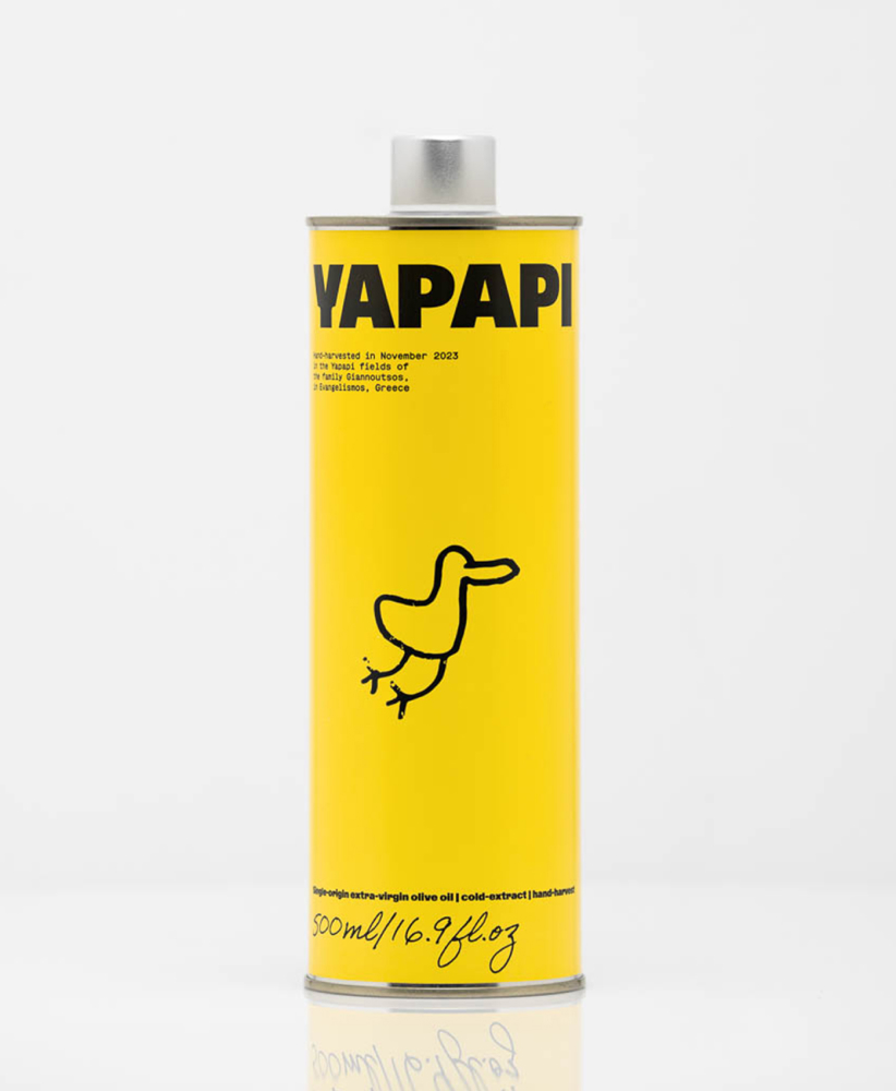
Yapapi is the name of a hill belonging to the family, on which olive trees are grown facing the Mediterranean. It means “duck” in greek language. Proposing a strong identity with a friendly illustration paying tribute to duck, a non-conventional choice for olive oil brand. Accompagned with recognizable pur yellow and a strong impactful and graphic typography. Each bottle is numeroted by hand each year of production.
A very playful and out of standards brand.
Industry
Knowledge
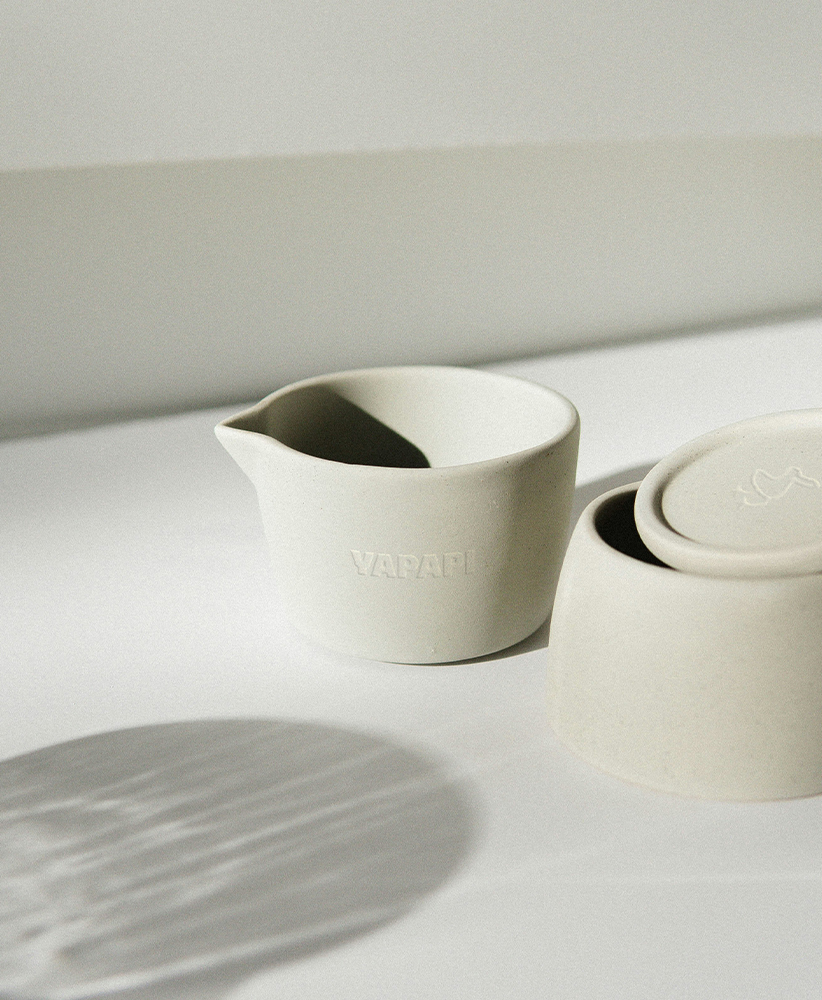
Packaging
Visual Identity
Typography
GT Maru Mono